
Script
No style
Flowing chicano-style calligraphy with balanced flourishes. The thick-and-thin stroke contrast is what makes it read as hand-lettered rather than a font.
Made with StenGen
Over 5M monthly views on Pinterest — see the gallery.
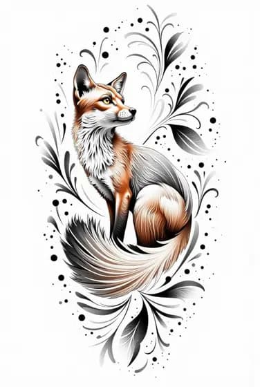
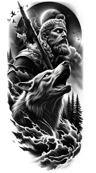
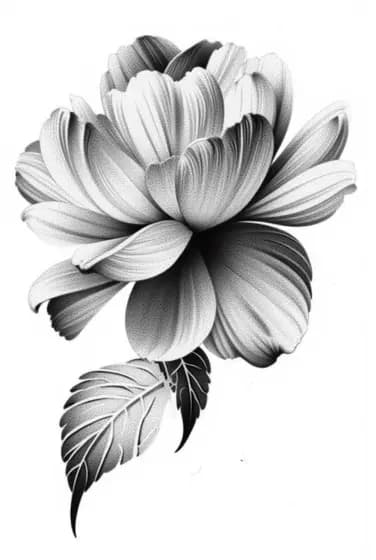
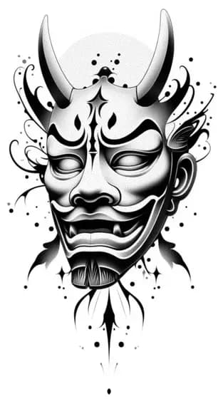
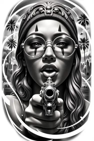
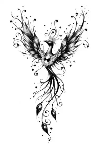
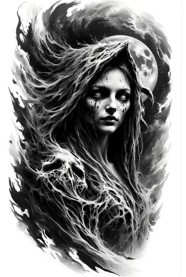
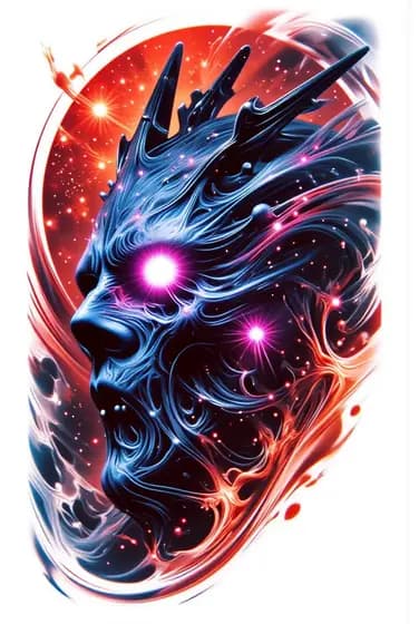
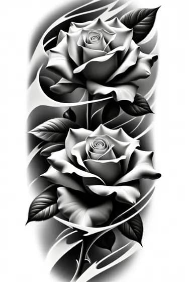
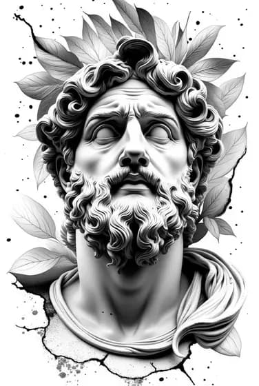
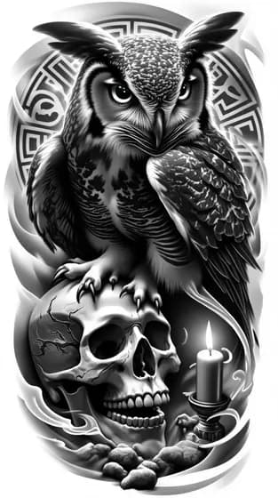
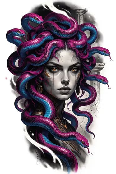
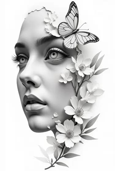
The comparison
Prompt: “single rose design”. One style at a time, strength 80%. Tap any thumbnail.
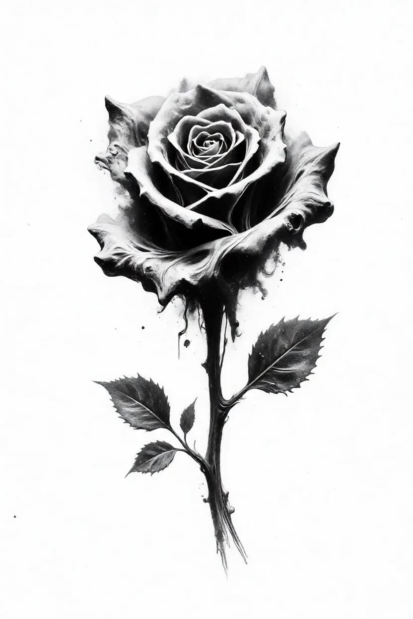
Smoke, ash and dissolve
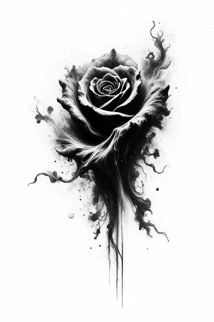
Edges are eaten away and the form dissolves into wisps, black bleeding down the stem, grain like charcoal dust. Atmospheric — and hungry: at full strength it eats the detail you asked for.
Best for Ethereal, haunted and decay-themed pieces where the subject should half-disappear.
Run it lower than the other styles. Above roughly 60% it starts swallowing the subject instead of dressing it.
The idea worth keeping
Ten styles is a lot to remember. Four is not. Every style builds a form in one of these ways — name the one you want and the choice makes itself.
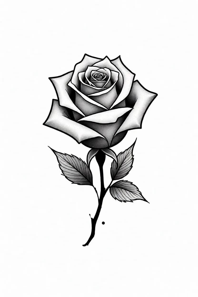
A closed outline does the work; whatever sits inside it is secondary. Fastest to tattoo and the safest to age — the contour holds the shape long after soft grey has settled.
Simple LoraNeo TribalColor v1StenGen v2
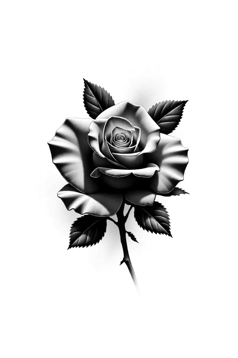
Almost no outline. Petals, muscle and bone are sculpted by the jump from white highlight to solid black. Needs real skill with soft gradients, and rewards it.
StenGen BasicRealism v1Realism v2
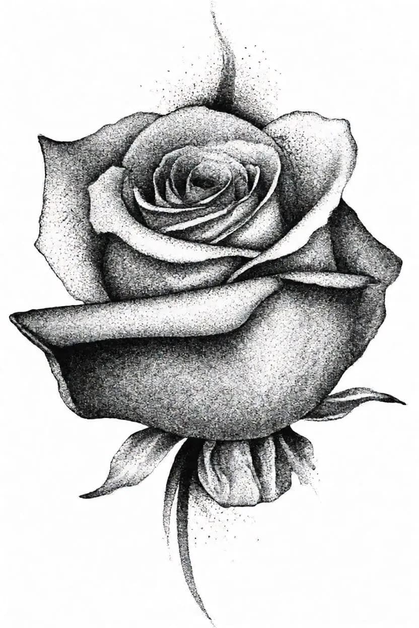
The shape emerges out of grain, brush wash or smoke. The surface itself is the style — you are not drawing an edge, you are building density.
Dotwork / WhipshadingDark Ghost
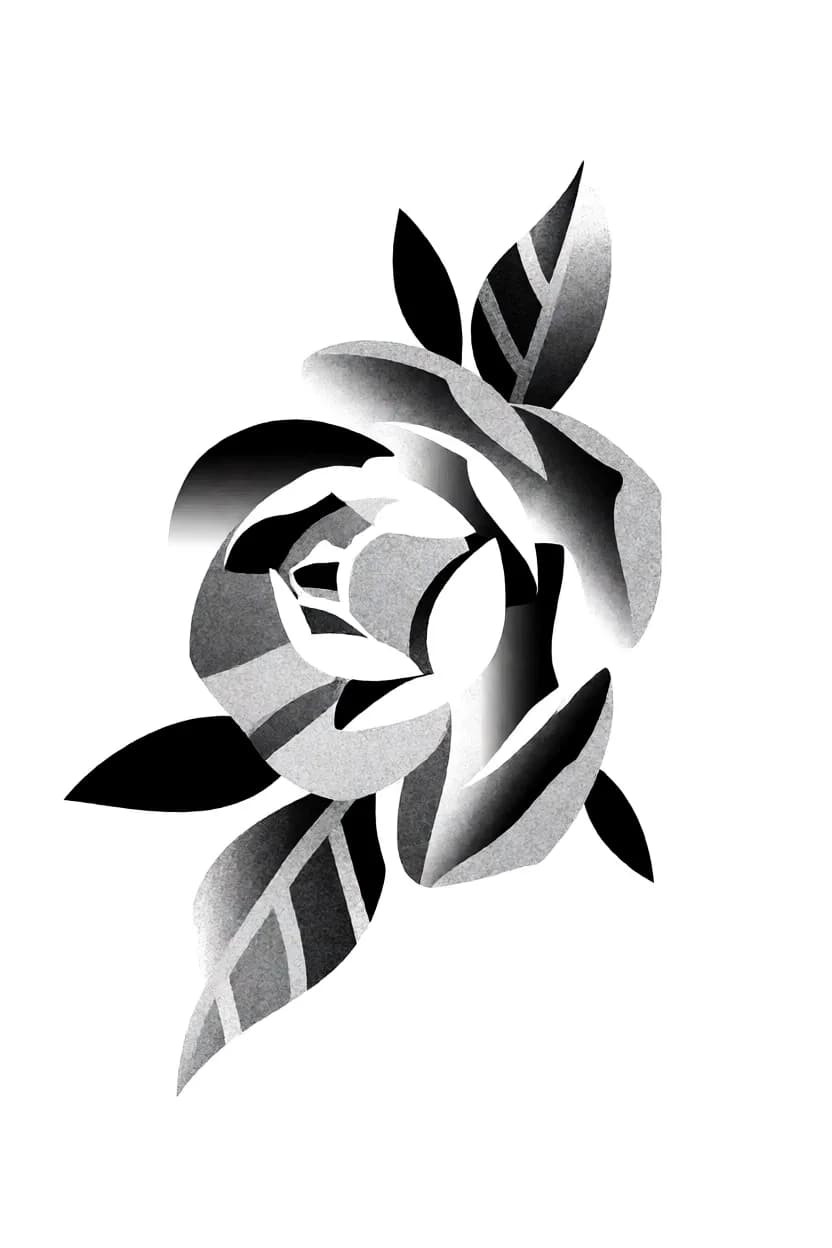
Everything is cut into flat shapes with hard borders. The least detail, the most impact from across a room.
Cartoon
A style is a LoRA: a model trained on real tattoo work until it learned one look. Pick none and you get the raw engine. Stack up to three — one leads, the others season.
The dial nobody explains
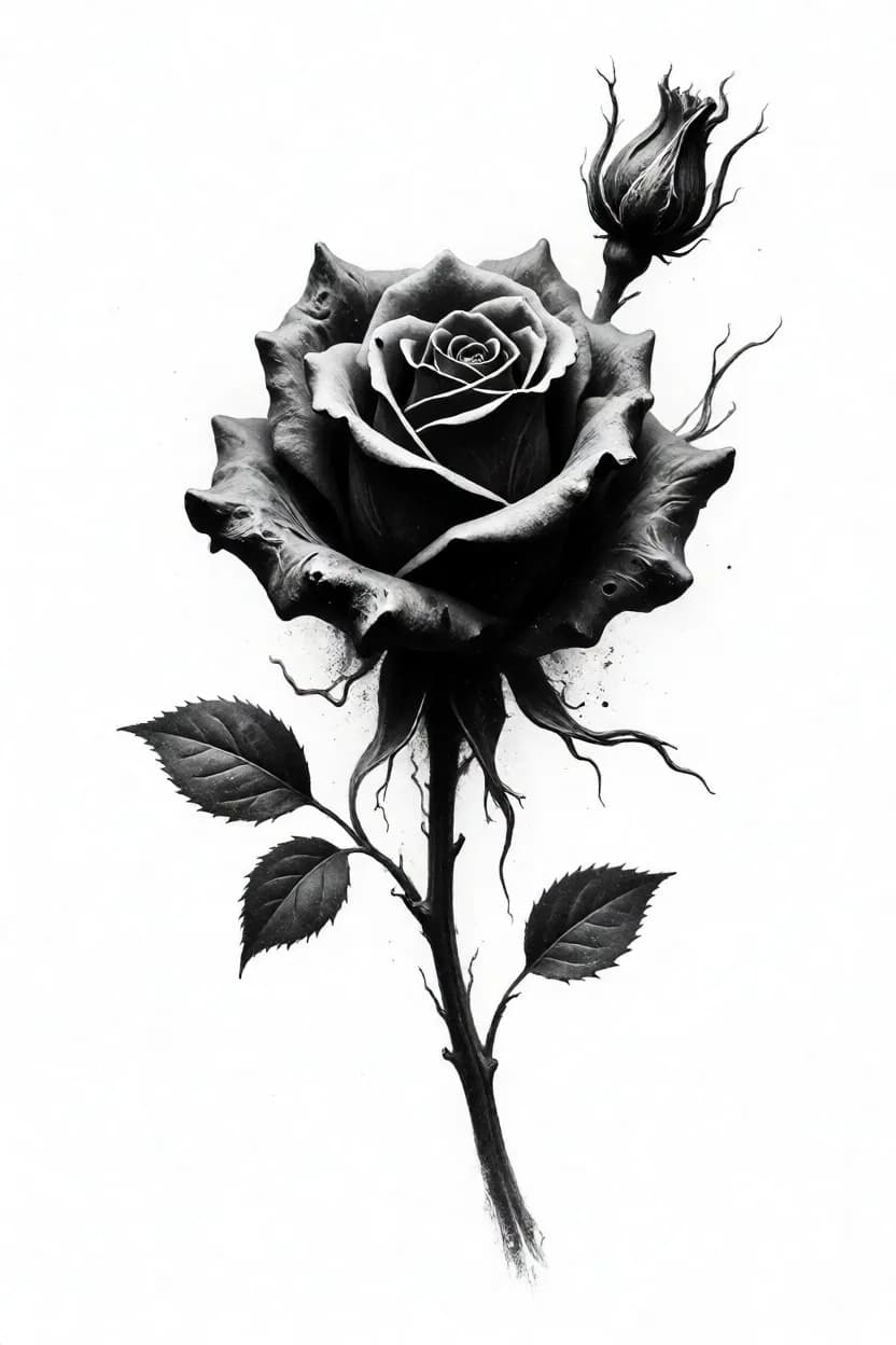
Same prompt, same style — Dark Ghost — at four strengths. Drag it and watch the texture arrive, then eat the design.
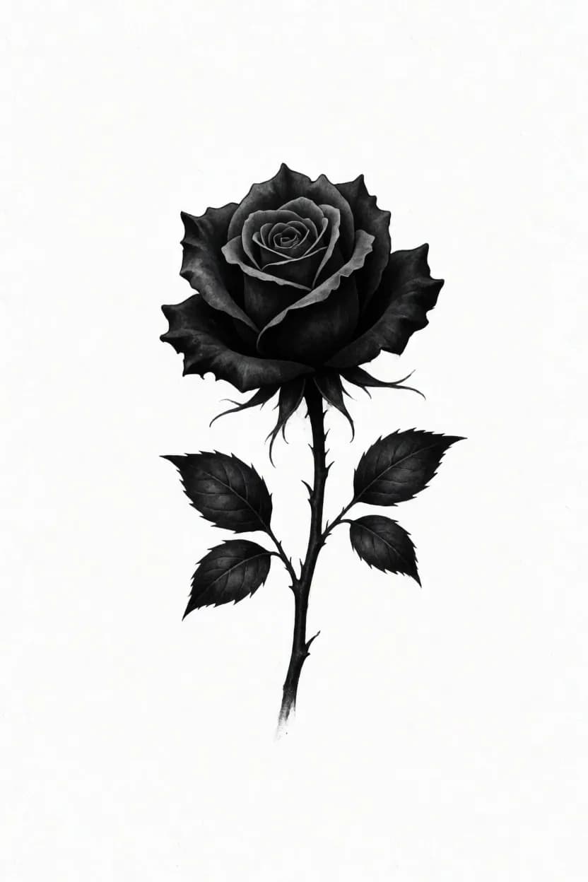
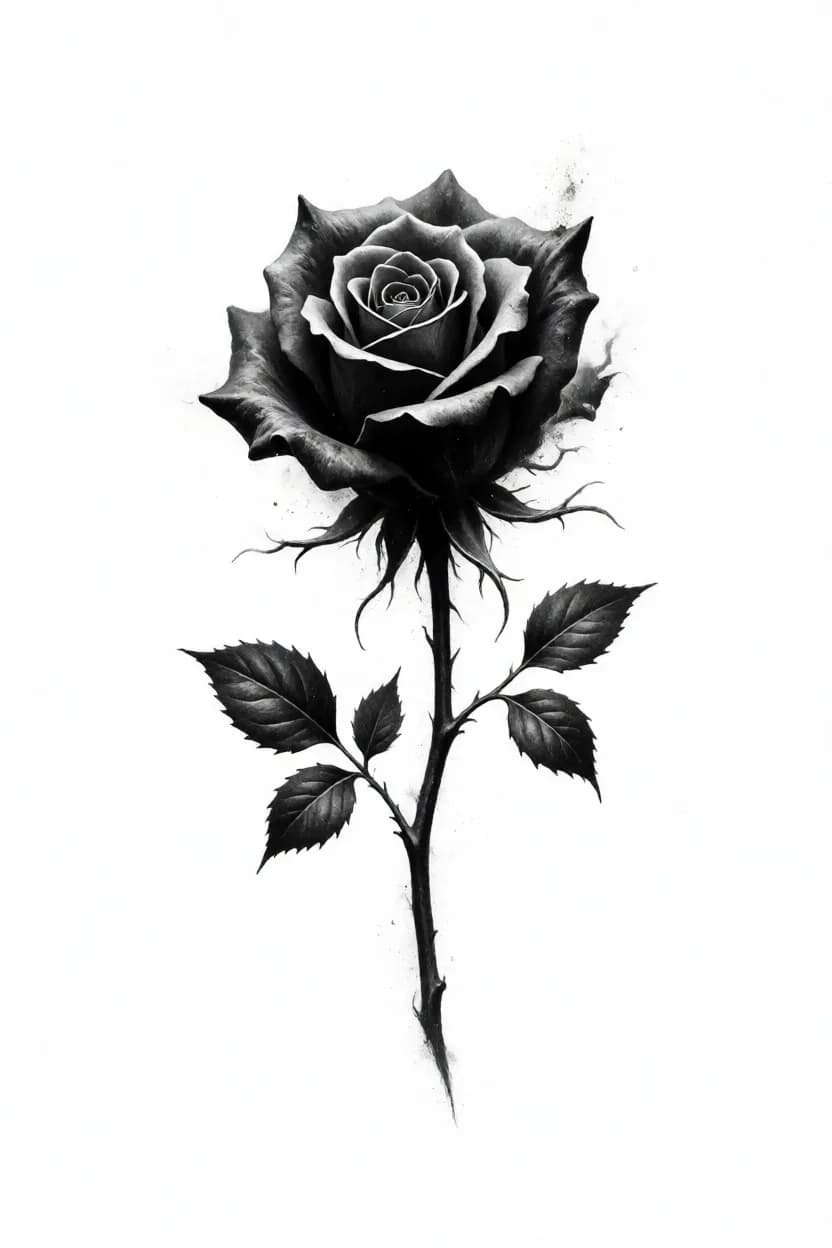
Drag it
30%
The subject still holds — proper leaves, a real stem — but tendrils creep off the petals and ash starts to speckle the edges. Character without losing the design.
Same prompt, same style, four strengths. Weight is not a quality slider — it decides how much of the design belongs to you and how much belongs to the style.
The part people miss
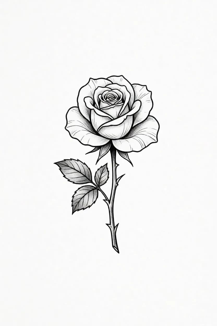
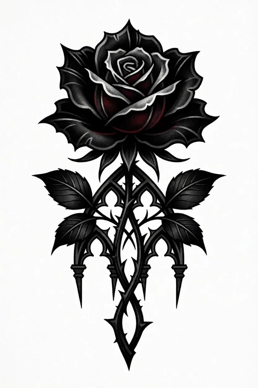
Both of these ran with no style selected at all. The only difference is two extra words.
“single rose design”
Thin, tentative line, small subject floating on the page. Nothing is wrong with it — there is just nothing in the prompt pushing it anywhere.
“single rose design, gothic dark”
Two words later: heavy blackwork, cathedral tracery, a dark red heart, a cross of thorns. Same engine, no style, different piece.
Tap or hover the parts
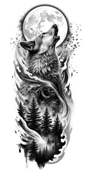
a geometric wolf head, sharp angular facets, piercing eyes, dark gothic mood, dense fine detail, centered composition

And here it is
Faceted planes, a hard stare, deep contrast — every part of the prompt is visible in the render. That is what a specific prompt buys you.
StenGen Basic50%
The one thing LoRAs break
Put the exact words in quotes and run with no style. Every LoRA warps letterforms — the plain engine and StenGen v2 are the only two that keep text clean.
No style
Flowing chicano-style calligraphy with balanced flourishes. The thick-and-thin stroke contrast is what makes it read as hand-lettered rather than a font.

No style
Heavy gothic with ornate serifs. Dense and dramatic — leave breathing room around it, because blackletter fills every millimetre you give it.
The rule: spell the words exactly as you want them inked, inside quotes. Run with no style, or StenGen v2 if you want the cleanest line. Any other LoRA will scramble the letters.
One muse, three goals
The same subject taken to three different destinations: clean black & grey, a two-style mix for realism, and full color. Read what changes between the prompts — that difference is the craft.
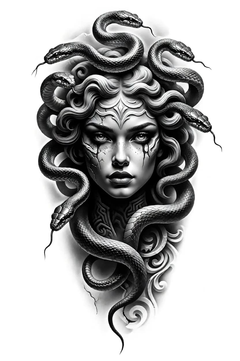
StenGen Basic55%
Name the composition, the mood, and what you do NOT want. The closing list of negatives keeps the background clean and stencil-ready.
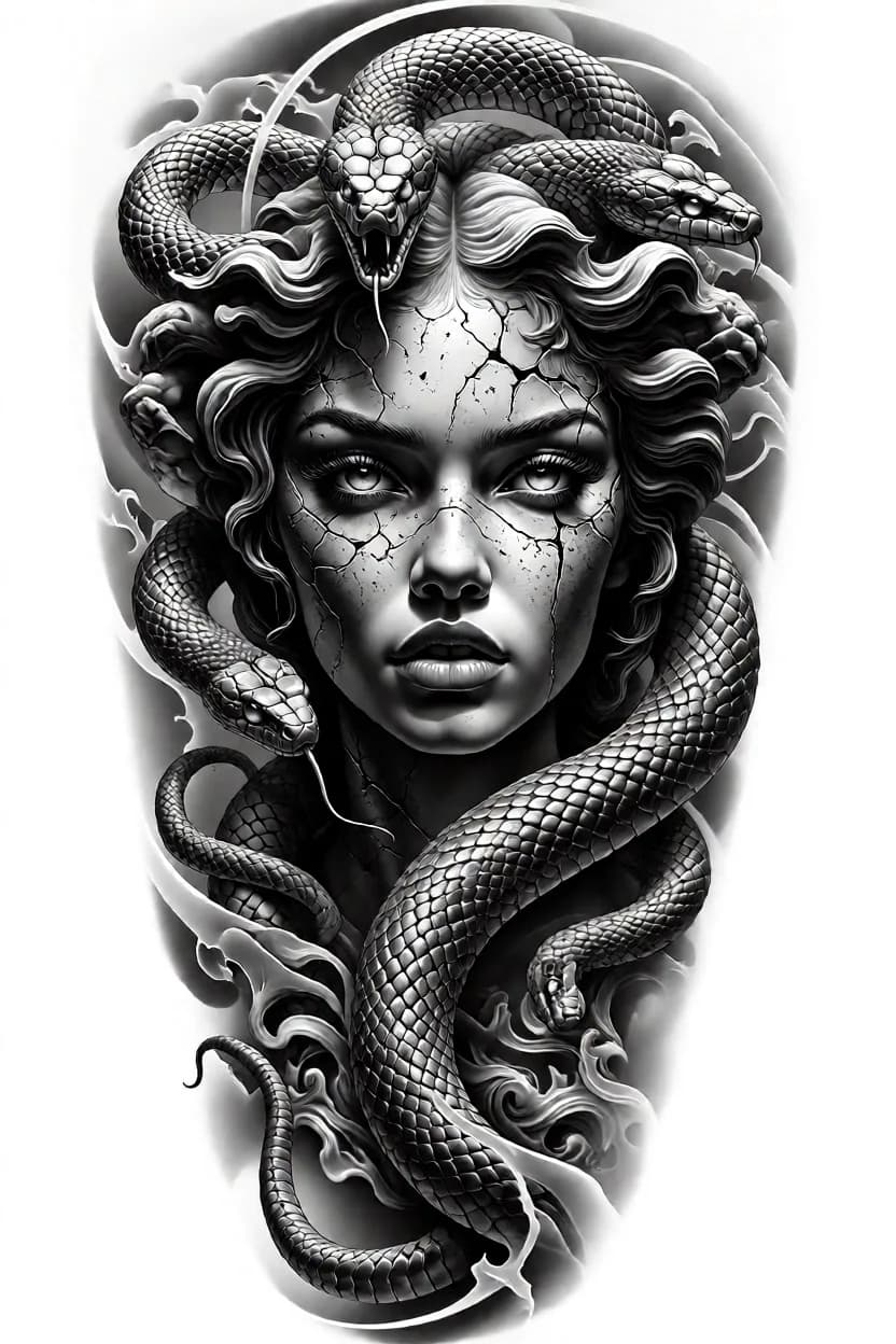
Realism v140%StenGen Basic80%
Realism carries the skin and scales, Basic holds the structure. The leading style takes the LOWER weight — it flavours the render instead of taking over.
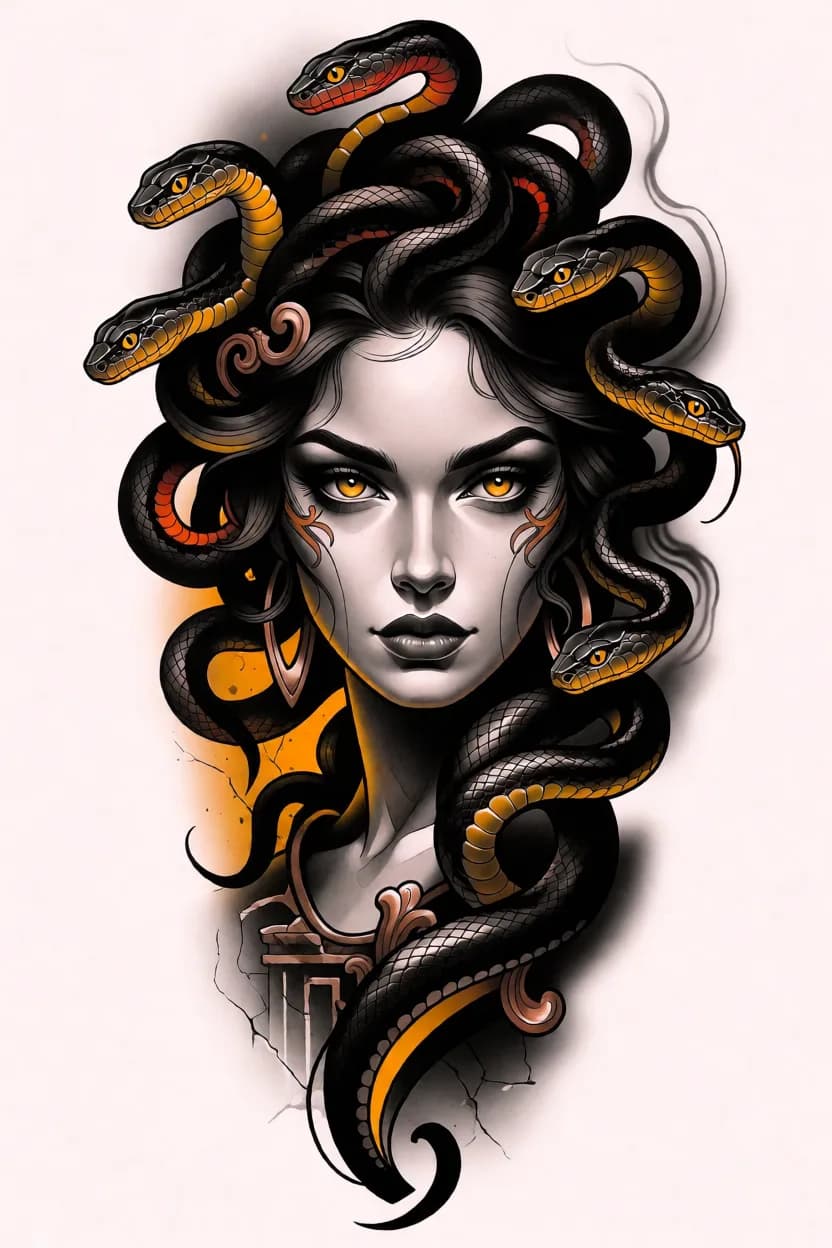
Color v140%
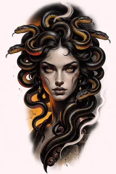
Say the palette out loud — gold in the eyes, bronze ornament, pale stone skin. Color follows named colors far better than the word “colorful”.
Design for the body
The longest thing the generator can hold. Four sleeves below — color realism, dark realism and two dragons from two schools — with the prompt behind each one and the four rules they all obey.
Run it at 9:16
A sleeve needs the tall canvas. At 1:1 or 2:3 the engine collapses the whole idea into one centred motif.
Write it top to bottom
Shoulder, then forearm, then wrist — in that order, each with its own objects. The engine follows the order you write.
Name one connecting thread
Waves, smoke, hair, roots. Something that runs the entire length, or the piece falls apart into three unrelated tattoos.
Front-load it
The engine reads about 2000 characters — anything past that is silently dropped. Composition goes first, polish words last.

Color realism · full sleeve
Every light source is named as an object: the mushroom caps glow, the crystal glows, and everything else is lit by them. That is the difference between neon that looks real and neon that looks like a poster filter.
Top
Her face, lit from below
Magenta rim-light along the jaw, indigo shadow on the far side. The light has a source: the mushrooms under her chin.
Middle
Caps that glow
Fleshy mushrooms with gills, each lit from inside so the light spills onto the hair and casts a real shadow.
Bottom
The crystal
The hair braids into roots over a crystal glowing white — the second brightest point, at the far end from her face.
No style. Her face and the crystal are the two brightest points, deliberately at opposite ends — that is what pulls the eye the full length.

Dark realism · full sleeve
Full length costs you the face. Here the head is a close-up filling the width, lit hard from below by the fire at the wrist — so the light itself is the thread tying top to bottom. The contrast line spells out pure black, open grey, brilliant white so the piece never settles into flat grey.
Top third
The close-up
Head filling the width, tilted back, eyes on you. Fire from below puts white on the jaw and brow; the top of her head drops into solid black.
Middle third
Smoke, the thread
The brightest open area of the piece. Burning pages tumble through it, a raven cuts across in silhouette.
Bottom third
The burning church
Gothic silhouette in solid black, flames as pure white through the walls. The second white point — at the wrist.
Realism v2 60% smooths it into airbrushed black-and-grey; the same prompt with no style comes out grittier and more photographic. Both are here — flip between them.
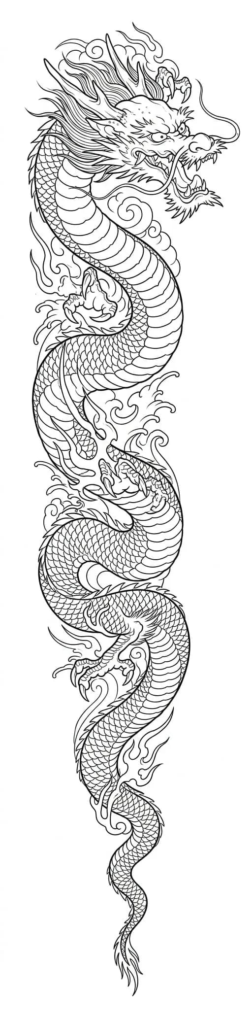

The same creature
Left: pure stencil line — the prompt forbids shading, so the engine draws only contour. Right: the Japanese canon — waves in every gap, wind bars, solid blacks. Same animal, two different jobs, both with no style at all.
No style9:16
Full sleeve dragon — pure linework
For a sleeve, describe the placement, not just the creature: where the head turns, where the body thins, where the negative space goes. The list of 'no shading, no grey, no textures' is what forces clean stencil line.
No style9:16
Japanese — the canon, not a scene
A Japanese sleeve is built by rules: one main motif on a diagonal, waves filling every gap, wind bars cutting the arm into readable bands. Naming those bands is what stops a 1:4 composition from falling apart down the length of the arm.
Proof it holds up
The rose was simple on purpose. Here is the same principle on work you would actually book.
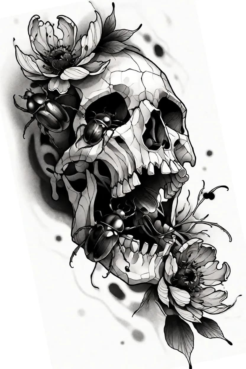
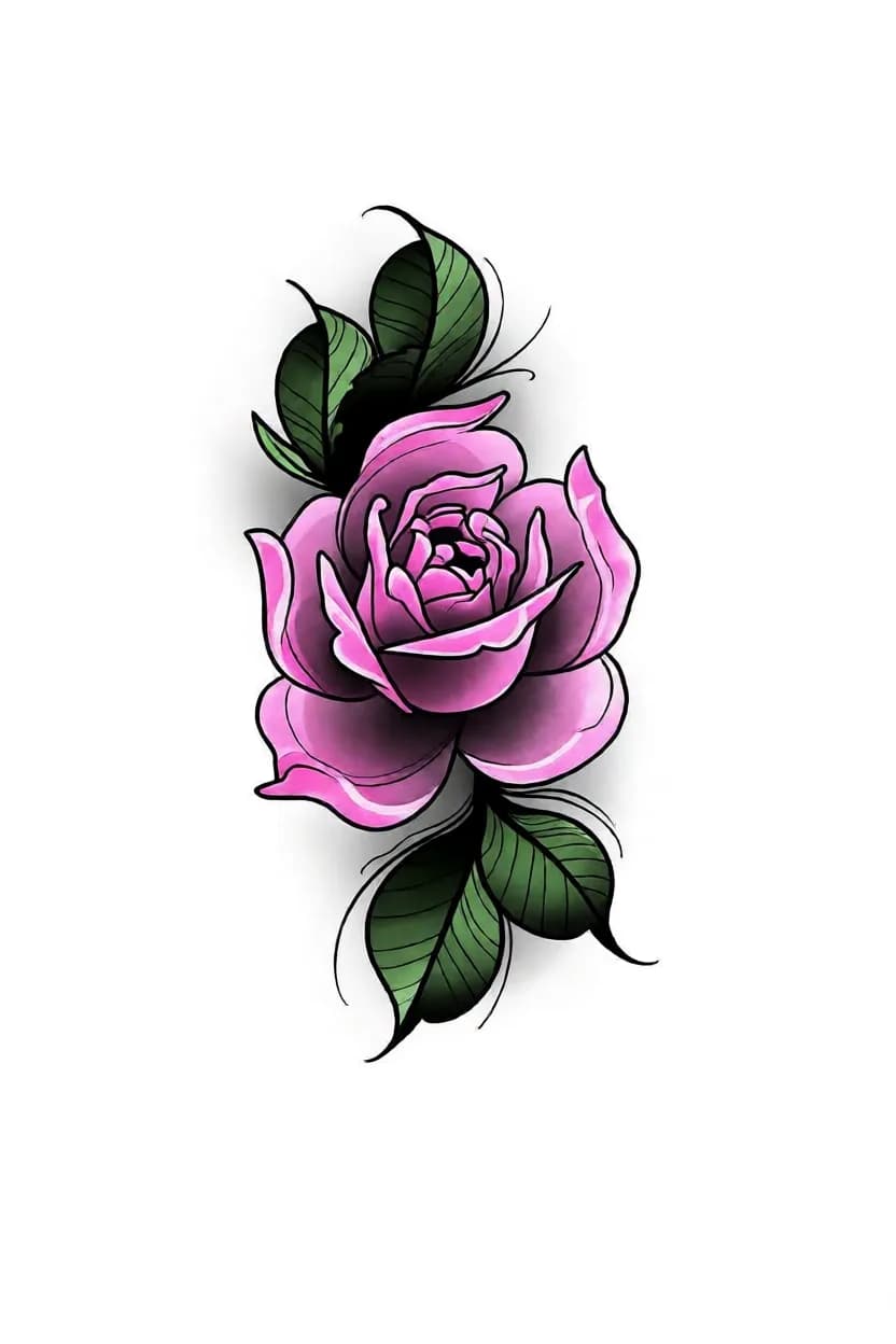
Simple Lora
Outline first: crisp edges, graphic petals, everything readable as line.
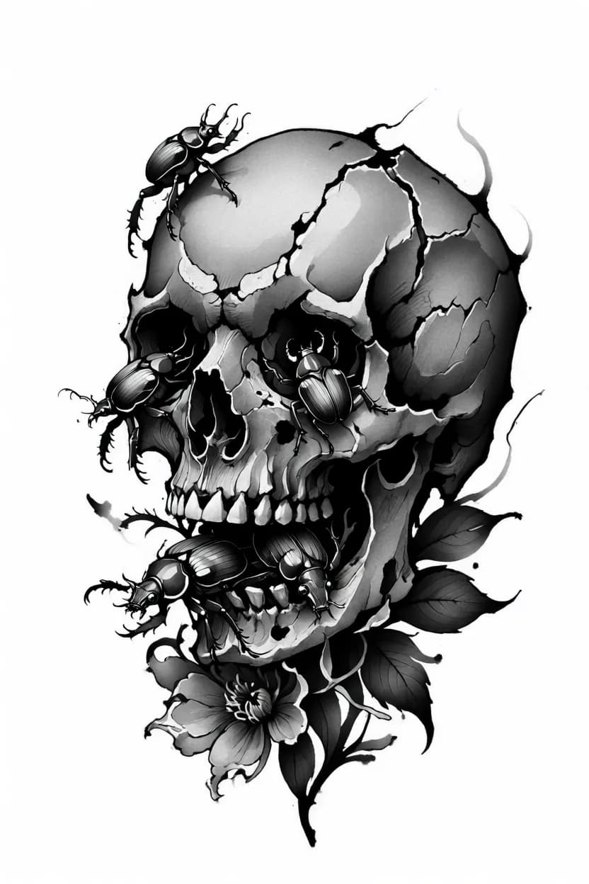
Neo Tribal
Torn edges and flat grey flooding the bone, black running off it.
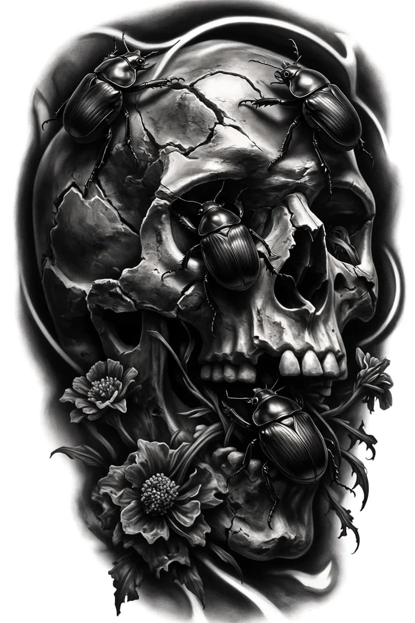
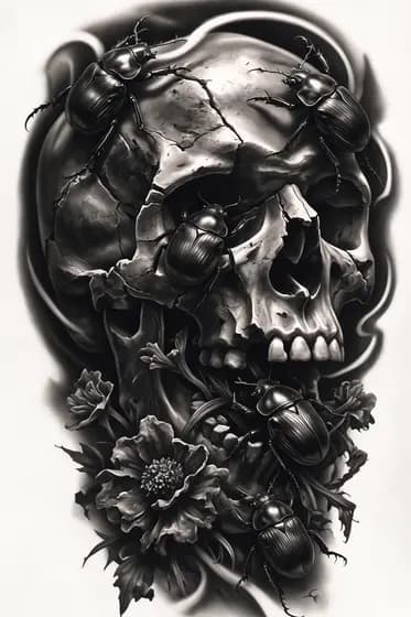
Realism v2
Full weight and volume — polished beetle shells, deep sockets, black surround.
One prompt, three chips. Everything else identical.
Prompt to skin
One booking, three steps, nothing staged: the prompt became a design, the design became a stencil, the stencil became a calf piece.

Healed, on a real client
On skin
Tattooed on the calf. The composition survived the transfer because it was built as a tattoo, not as an illustration.

1The design
Generated from a prompt: father and daughter from behind, matching shirts, palms, smoke framing.

2The stencil
Same design through the Stencil Extractor — clean traceable line, ready to print.
This is the whole point: a prompt is not the finished work. It is the fastest way to put something real in front of a client.
If words are not your thing
The sparkles button inside the generator. Describe the idea in plain language — in your own language if you prefer — or tap the mic and say it out loud.

The mic transcribes straight into the box so you can edit before sending.
It returns several variants — realism, minimal, dark, color. Tap “Use” on the one you like.
Treat the result as a starting point. Change a word or two before you generate.
Your turn
The exact prompt, both styles and their weights — loaded into the generator, ready to run. Change one word or the whole subject.